Client:
Ashton Hills Wines
Rationale:
Wine Labels
The brief called for a revamp of two existing products.
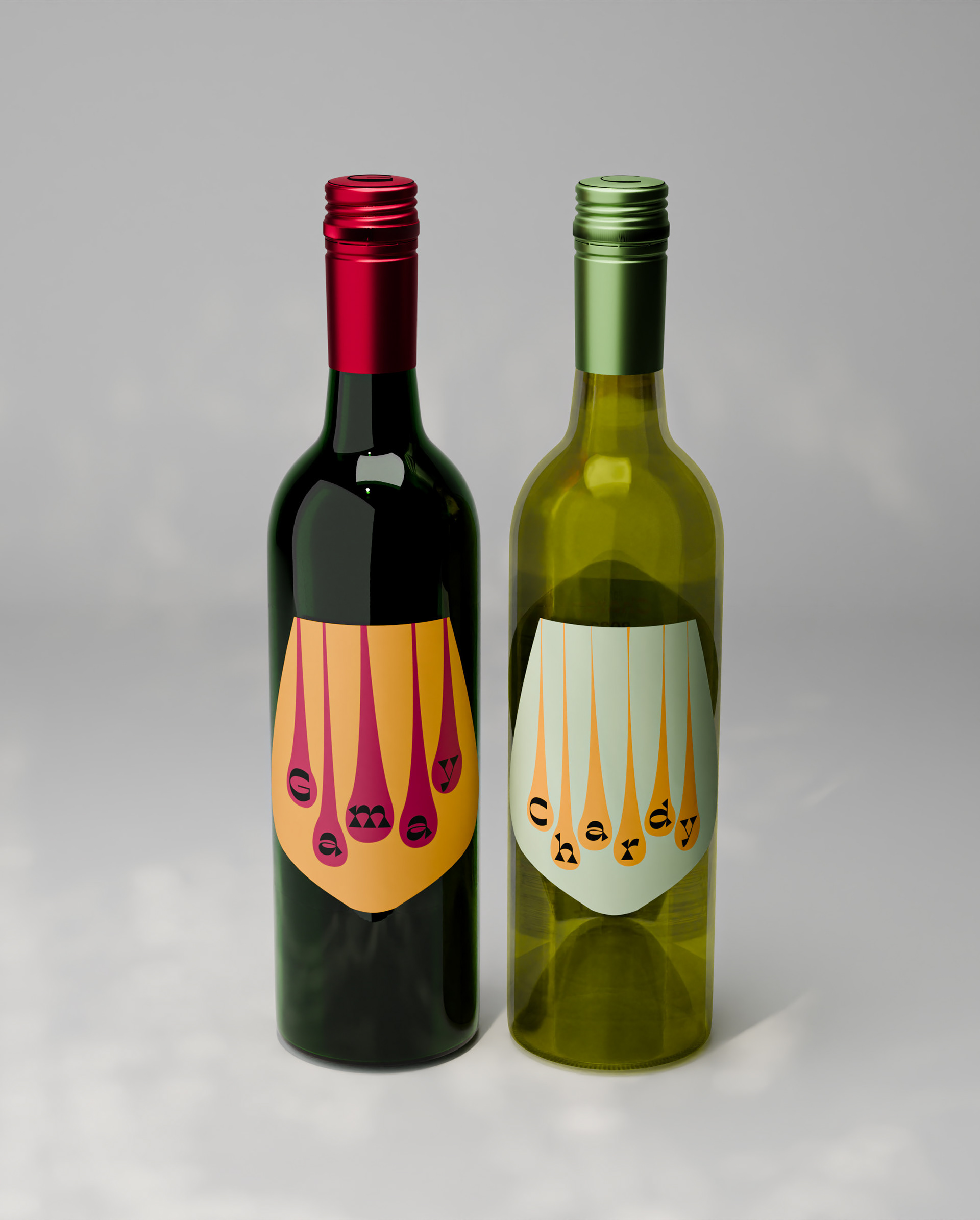
In this case I have chosen Gamay and Chardonnay from Ashton Hills Wines.
The intention of the redesign is to make these products more appealing visually to a new target market, namely mid 20s to mid 30 year olds who might not necessarily be wine consumers. At the same time the new design must not deter the current consumer base which is an older and more established consumers who know and value the products.
A careful balance had to be found to meet both these target markets.
This drove the choice of wines, Gamay and Chardonnay. Gamay is a newer and relatively unknown varietal in Australia. It is a light fruity and fresh red generally drunk young and is popular in France where it is used to make Beaujolais. Chardonnay is a well known type in Australia, also a French varietal, but has fallen a little out of favour. A fuller bodied white wine still driven by fruit but also quite earthy. I felt that they compliment each other and would be marketable as an interesting pair. The Gamay would be new to both markets while the Chardonnay perhaps seen more as a recognisable old favourite.
The new label designs are loosely based around the Mid Century Modern design style that is broadly popular at the moment. It was chosen as it would appeal to both the new target market who may find it fun and funky and with the established target market who will find it more familiar and nostalgic. Market research was done along with some subjective research to determine how flavour terms might relate to form and colour.
Lighter colours were favoured with the profiles of both wines along with rounded and blobby shapes.
Lighter colours were favoured with the profiles of both wines along with rounded and blobby shapes.
The generic wine glass shape was created as the background for the label, conforming to a rounded gentle shape. What do we see on the sides of a wine glass? We see the legs, the drips that crawl down the edges. These shapes are also rounded and blobby while also making an ideal background for the name of the wine itself. The typeface Blackest was chosen for the names. It is an angular typeface with an interesting reverse contrast. This typeface has been chosen as it has the required Mid Century Modern look, the contrast makes it unusual and so draws the eye and lastly, the angular nature is there to reflect the earth tones in the flavour of both varietals.
The back label has the same shape as the front, with an extension to allow for the various mandatory elements, except that it has been inverted. This inversion creates a nice interplay between the front and the back labels, with an angular space, making this design unique.
The front label has been left very minimal with all the details being on the back label. The shape with its large space of colour, contrasting drips and the name will stand out against the plethora of complicated and fiddly labels on the shelves today.
Though the Gamay has been labeled as such, the Chardonnay is labeled as "Chardy".
The use of this vernacular term serves two purposes. The first is that it makes the product friendlier, fun and more familiar. It also allows the word to sit within the limited number of drips that will fit on the label, also creating balance with the word Gamay.
Overall the Mid Century Modern minimalism, appropriate colour choices and rounded shapes should attract the eyes of both the new target market as these labels will stand out on the shelf with a fun and fresh approach. It will delight the established market with a new approach that evokes a sense of fun and nostalgia.
Motion Graphic
The motion graphic is created to bring the label designs to life in an eye catching way that plays upon a feature of the Instagram platform.
To view content, a viewer scrolls the page with the top of the content appearing at the bottom of the page and moving its way upward via the scroll.
Since we have drips on the label, it makes sense to have those drips work with that scrolling action. The drips appear in the small section when the video first appears and appear to travel in relationship to the scroll, creating a sense that the viewer might possibly be making this happen. This should create an extra moment of engagement in the viewer, possibly giving them reason to scroll it again.
The colour and graphic of the label dominates to begin, with a resolution to the final form against a bottle and the winery name at the end. All of this action is timed to the music which has been especially chosen to reflect the idea of a fun wine and the experience of drinking it with friends.
The production of this animation is fairly simple and cost effective. The elements are taken from the label artwork itself, with some modifications to have it sit in the 9:16 vertical video format and to allow for movement. No 3D elements have been used. Instead the bottle background that the label resolves onto is built using a multipoint gradient that gives the impression of a bottle.