The Client:
The Australian Migrant Resource Centre (AMRC)
The Brief:
The final product will be part of an exhibition of posters and will have a wide appeal. It is expected that the tone be educational in nature and supportive of refugee communities.
Try to avoid overly dark and horrific themes. Ensure respect for all involved in the message.
Try to avoid overly dark and horrific themes. Ensure respect for all involved in the message.
Target Market:
The purpose is to give the refugee community a voice. Any visitors to the exhibition will be the target market. Since the competition is open from primary to tertiary students, it is envisaged that anyone in that age group will form part of the target market. There will also be a judging panel from the organisation and they should also
be seen as a very important component to the target market.
Process:
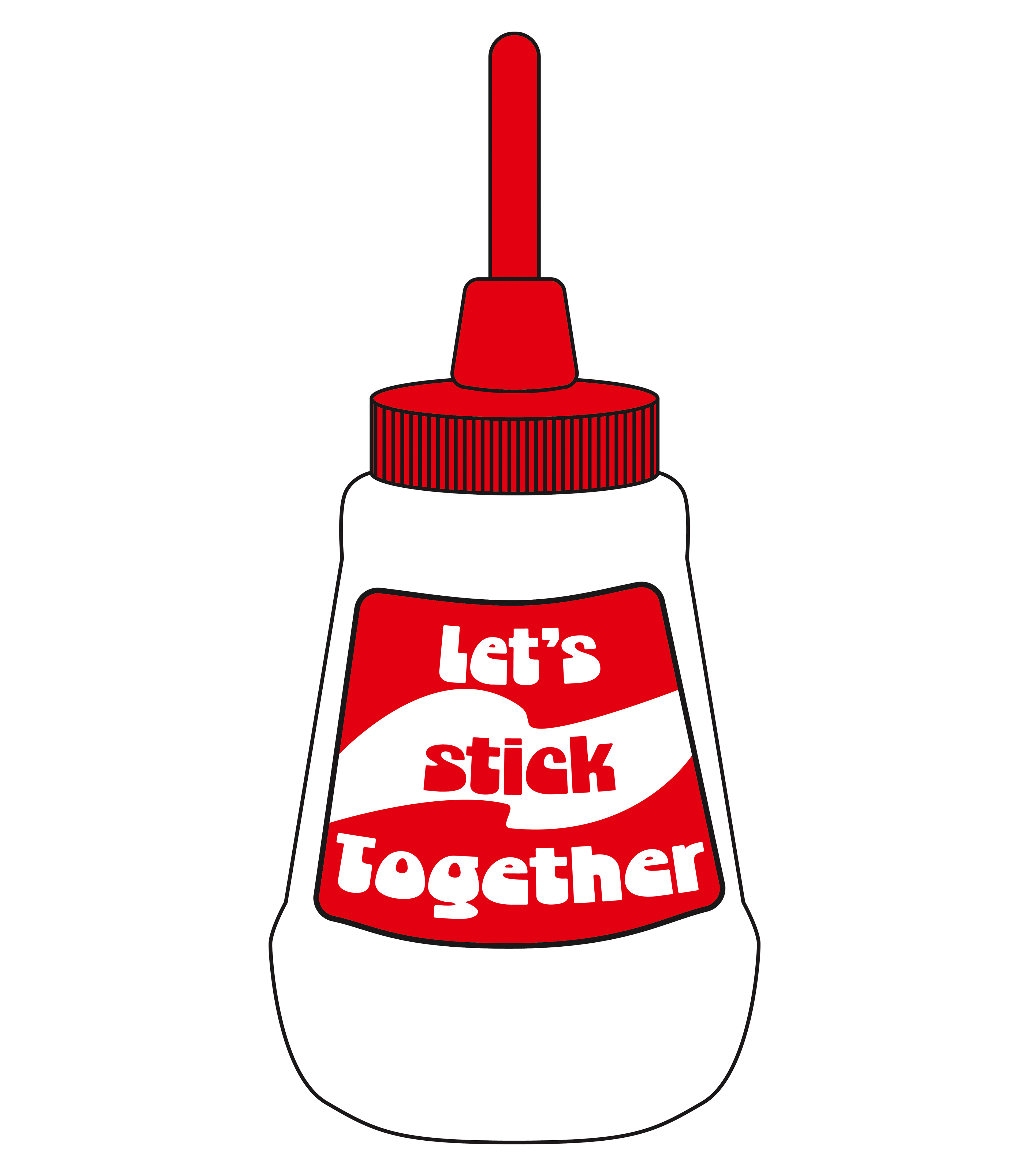
This was a tricky brief in a number of ways. Firstly, to stay away from the obvious dark themes that surround refugees and to make something welcoming without resorting to clichés. I looked at various themes as you can see from the rough sketches below . Feedback was sought and the choice was narrowed down to the diagonal lines and the Clag glue bottle.

I developed the Clag bottle with it's message of unity into an illustration but it didn't make the cut in the final judgement. While it is an iconic Australian symbol, it probably won't resonate with recently arrived people. I still like it and have decided to put it onto a T-Shirt. It is still a great message to display.
Rationale:
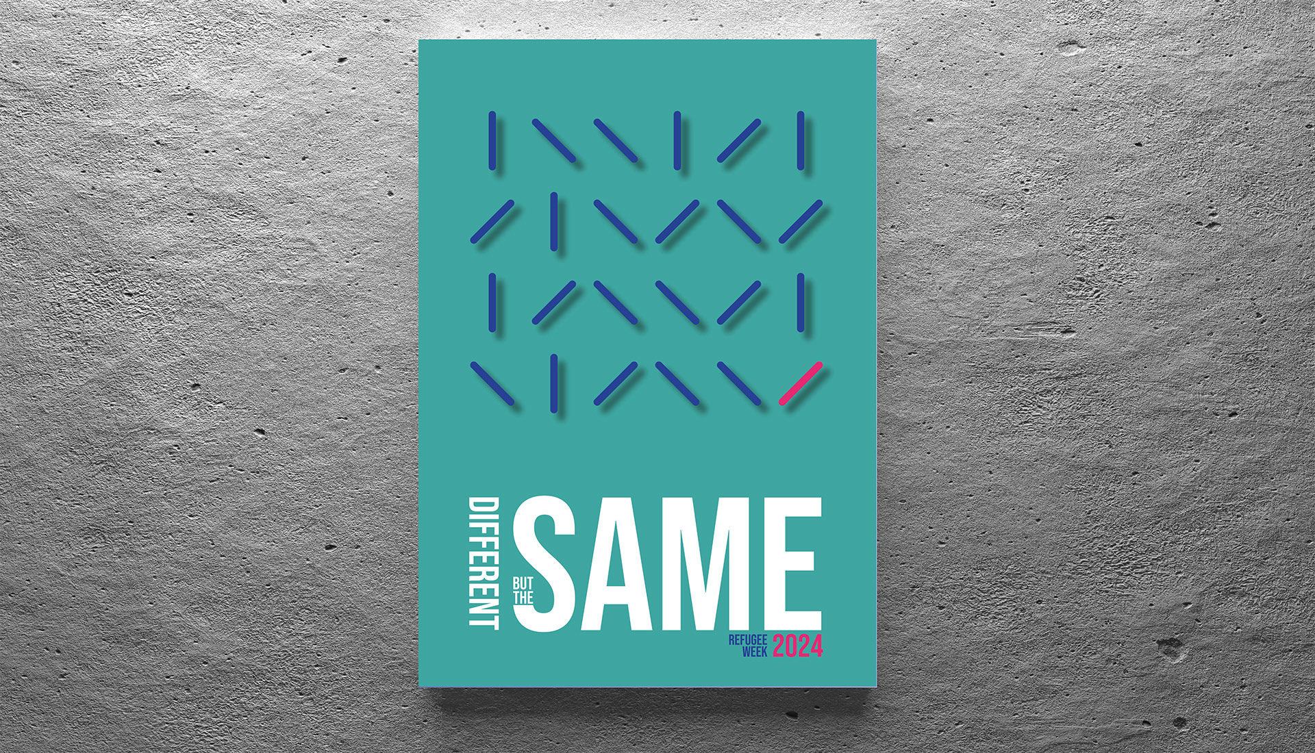
The problem to be solved here is to graphically represent that despite our differences, we are all fundamentally the same as people, with the same dreams hopes and aspirations. I wanted to do this without resorting to the usual tropes and stereotypical graphic elements. So I have used the simple graphic device of a single stoke to represent a population of individuals. All these individuals, a population, each a bit different but in essence all the same. The one pink line, representing the newcomer may look different, but they are the same, in length, share the same angle as other lines and is the same imaginary distance from the page (as indicated by the shadowing).
The image calls on use to not only think of ourselves, but consider the wider community as a cohesive whole. We can embrace the differences between us all while also knowing that we are all deep down, the same in our desire for a safe and comfortable life for ourselves.
The image calls on use to not only think of ourselves, but consider the wider community as a cohesive whole. We can embrace the differences between us all while also knowing that we are all deep down, the same in our desire for a safe and comfortable life for ourselves.