They say that a person who is their own lawyer has a fool for a client. I wonder what they say about a graphic designer who has themselves as a client?
It certainly was a difficult brief to undertake - to create a personal brand. Lots of introspection and internal dialog.
Do I need a logo? What typography would best represent what I do ? Why does my client never answer my questions?
There was already some branding that I applied to my previous website, CV and other assets. I wasn't sure I wanted to change it. But it was feeling a little old and so I pushed on into the process.
After some, quite frankly, disastrous and bonkers ideas, I went back to basics and created some chunky letters of my initials and a D for design. I played around, rearranging them, taking quick photos to record everything.
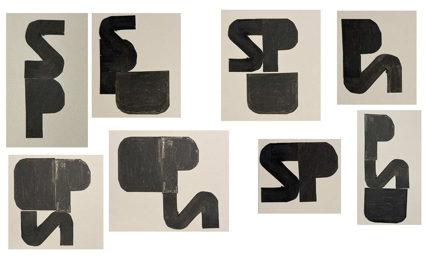
One particular shape stood out against all the others.

I loved it!
It is anthropomorphic and reminds me of some classic logos such as older TV production company logos.
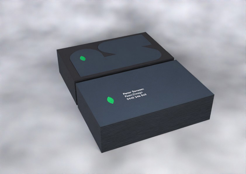
Finally as part of the assignment, I had to design business cards. The type I chose it the classic Gil Sans. It is based on Edward Johnson's "Underground Alphabet" and I am a bit of a train nerd. My client suggested that I "make the logo bigger" on the card, so it inhabits the entire one side. The eye I decided to make a bright green to draw more attention and create contrast with the dark stock I had chosen. I carried this through to the reverse side as an anchor for my name and details.
Here is a 3D render as I am yet to receive the cards and the client was bugging me to see how they would look.