
The Project:
Walk around your environment, gather examples of informal typography. Choose one and create a typeface including numbers, ensure that it is a .ttf or .otf file.
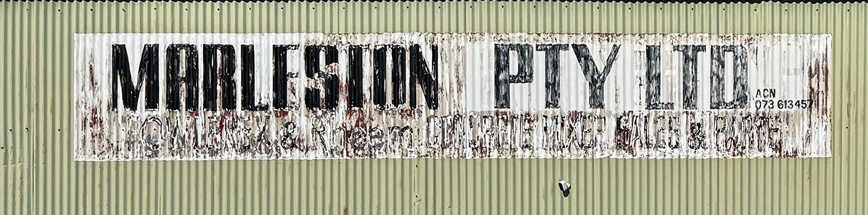
While walking back into the city from a class visit to MCC Adelaide, I passed an old business and grabbed some photos of this decaying piece of sign writing.
We were then to start sketching letterforms before we digital.
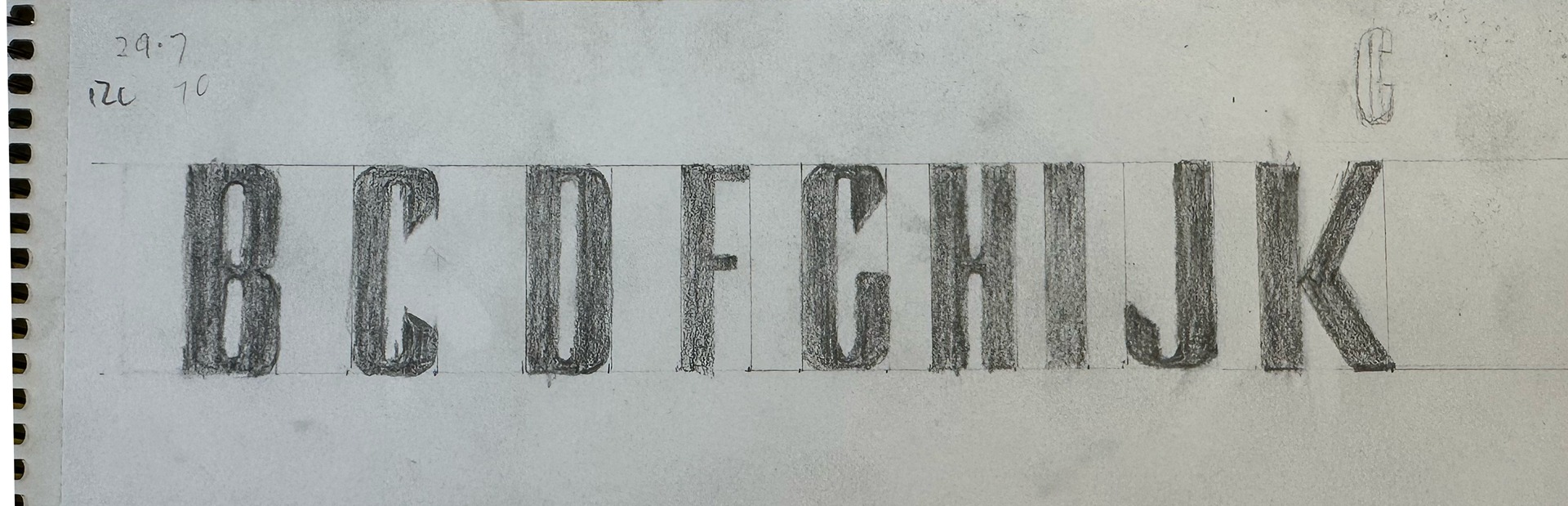
Once in Illustrator, the letterforms were drawn out using the pen tool.
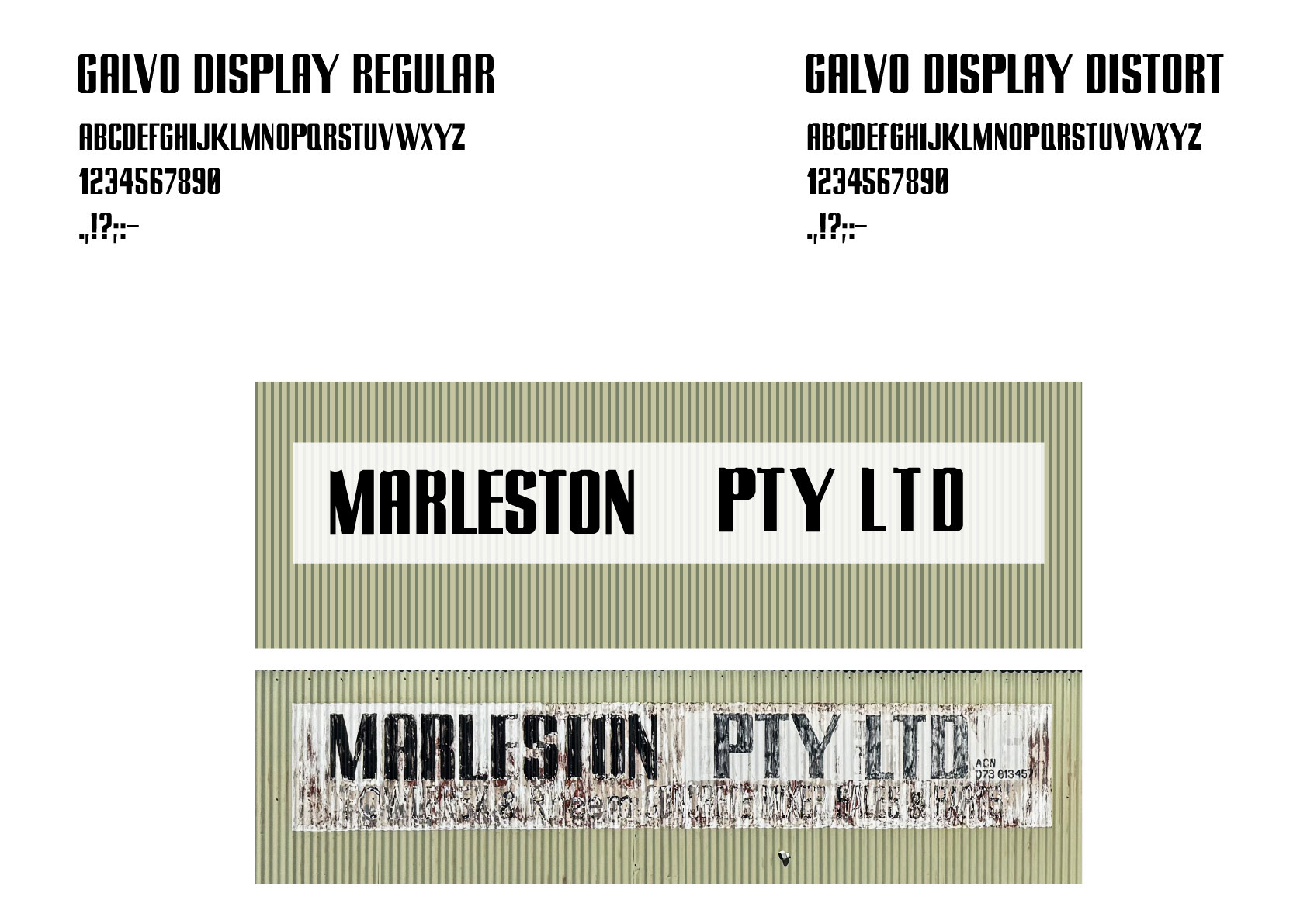
I used the Illustrator extension called FontSelf to package everything into an .otf file.
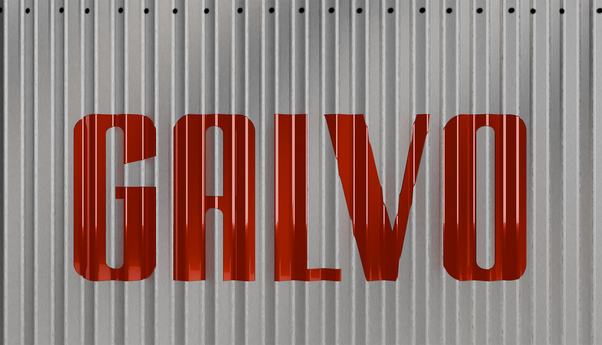
In the end my typeface contained two fonts. Part of the reason for choosing the sign was the distortions to the top of the letterforms caused by the corrugated galvanised iron it was painted on and I wanted to replicate this. Not an easy task. This required that I make a Regular version first so I could experiment with various methods of creating that top distortion. So I decided to include both. This turned out to be quite useful as I created a motion graphic of the typeface name being painted onto a piece of 3D modelled corrugated sheeting and composited onto a shed wall. The 3D model distorted the type in a very similar way to the original sign.
This was a fun project to undertake and I am especially pleased to have learn FontSelf as I can see that the simple ability to create custom typefaces, dingbats and other symbols will be very useful in the future.